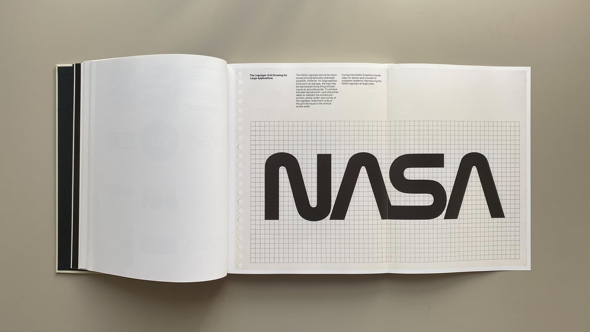
1. NASA Branding (Designed by Richard Danne & Bruce Blackburn, 1975)
NASA’s 1975 branding, known as the “Worm” logo, is an iconic example of modernist graphic design. Created by Richard Danne and Bruce Blackburn, the design stripped away any decorative elements from previous NASA insignias, reducing the brand to a sleek, continuous letterform with no additional embellishments. This rebrand was a radical shift that embraced minimalism and technology-focused aesthetics, aligning NASA’s identity with its mission of space exploration and innovation. Though the logo was controversially retired in 1992, it made a comeback in 2020, proving its timeless appeal. The NASA Worm logo makes use of line, shape, and negative space to create a clean, futuristic identity. The smooth, continuous strokes of the letters give a sense of fluidity and forward motion, symbolic of technological progress and exploration. The bold red color reinforces a sense of energy, passion, and visibility, ensuring recognition. The removal of crossbars in the letters “A” and “S” further simplifies the form, making the typography unique yet instantly recognizable. The design’s simplicity allows it to be highly adaptable across different mediums, from spacecraft to digital applications, showcasing the power of minimalism in branding.
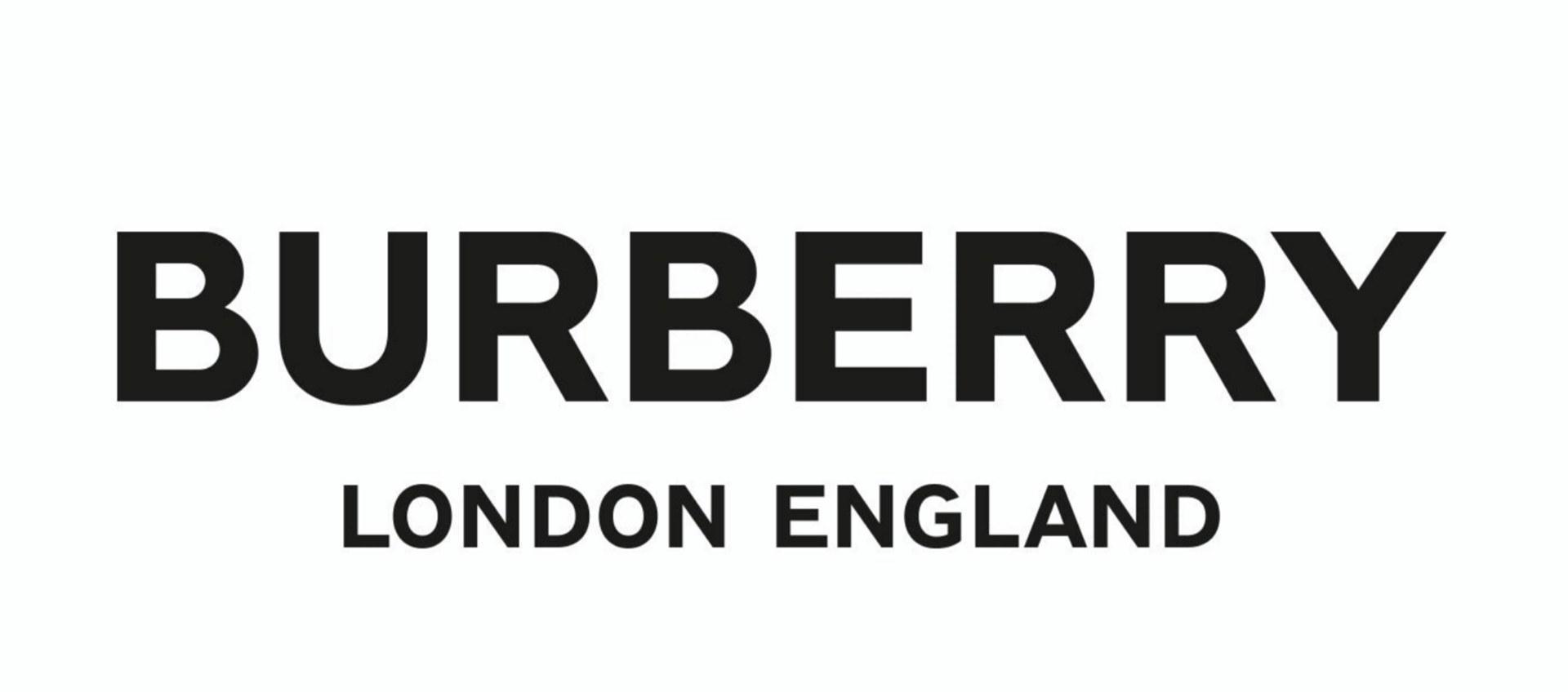
2. Burberry Rebrand (Designed by Peter Saville, 2018)
Burberry’s 2018 rebrand by Peter Saville was a bold departure from its classic, heritage-inspired serif typeface. This shift toward a modern, sans-serif wordmark was met with mixed reactions, as it eliminated the ornate flourishes that once defined the brand’s identity. However, the change was intentional—Burberry sought to create a more versatile and contemporary look that would resonate across digital platforms and international markets. The rebrand aligned the brand with other high-fashion houses that had embraced a clean, minimalist aesthetic. This identity relies on typography and simplicity as its core design elements. By removing serifs and adopting a bold, uniform typeface, Burberry’s logo achieves a timeless and adaptable look. The shift from an old-world, sophisticated style to a sleek, modern aesthetic reflects how luxury brands are evolving to appeal to a younger, more global audience. The lack of embellishments allows the brand to remain adaptable across digital and physical platforms, reinforcing the idea that good branding should work in any context.
3. City of Melbourne Identity (Designed by Landor, 2009)
City branding is often traditional and rigid, but Melbourne’s identity system, created by Landor, is a striking example of how cities can embrace modern branding. Rather than a fixed logo, the identity features a bold, geometric “M” that can be adapted in different colors and patterns while maintaining its recognizability. This flexibility allows the city to tailor its branding to different sectors, including tourism, business, and government initiatives, while maintaining a cohesive visual identity. This branding leverages geometric forms, color theory, and adaptability to create a dynamic identity system. The angular, multi-layered "M" represents Melbourne’s energy, diversity, and innovation. The use of gradients, bold colors, and intersecting lines gives the logo a sense of depth and dimension, making it visually engaging. Unlike traditional static city logos, Melbourne’s approach allows for customization while maintaining brand consistency, showing how a well-designed system can reflect a city's evolving culture and identity.