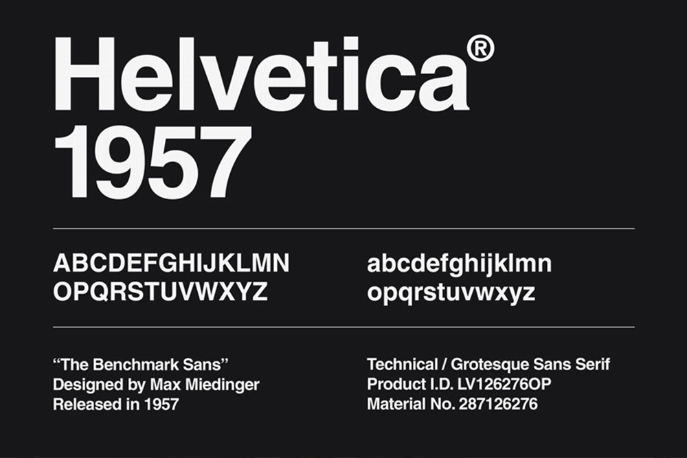
1. Helvetica by Max Miedinger
Helvetica, designed by Max Miedinger in 1957, is one of the most widely used typefaces in the world. Its clean, neutral design makes it a favorite for branding, signage, and editorial layouts. The typeface’s balanced proportions and consistent stroke widths contribute to its legibility and versatility.
I chose Helvetica because of its enduring presence in modern design. It connects to our studies on typography by exemplifying how simplicity and clarity enhance readability. Its geometric structure and uniformity adhere to principles of balance and unity, making it a go-to choice for corporate identities and wayfinding systems. Helvetica’s influence highlights the importance of minimalism in effective communication.
Citations
- Meggs, P. B. (2006). Meggs' History of Graphic Design. Wiley.
- Helvetica Documentary (2007). Directed by Gary Hustwit.
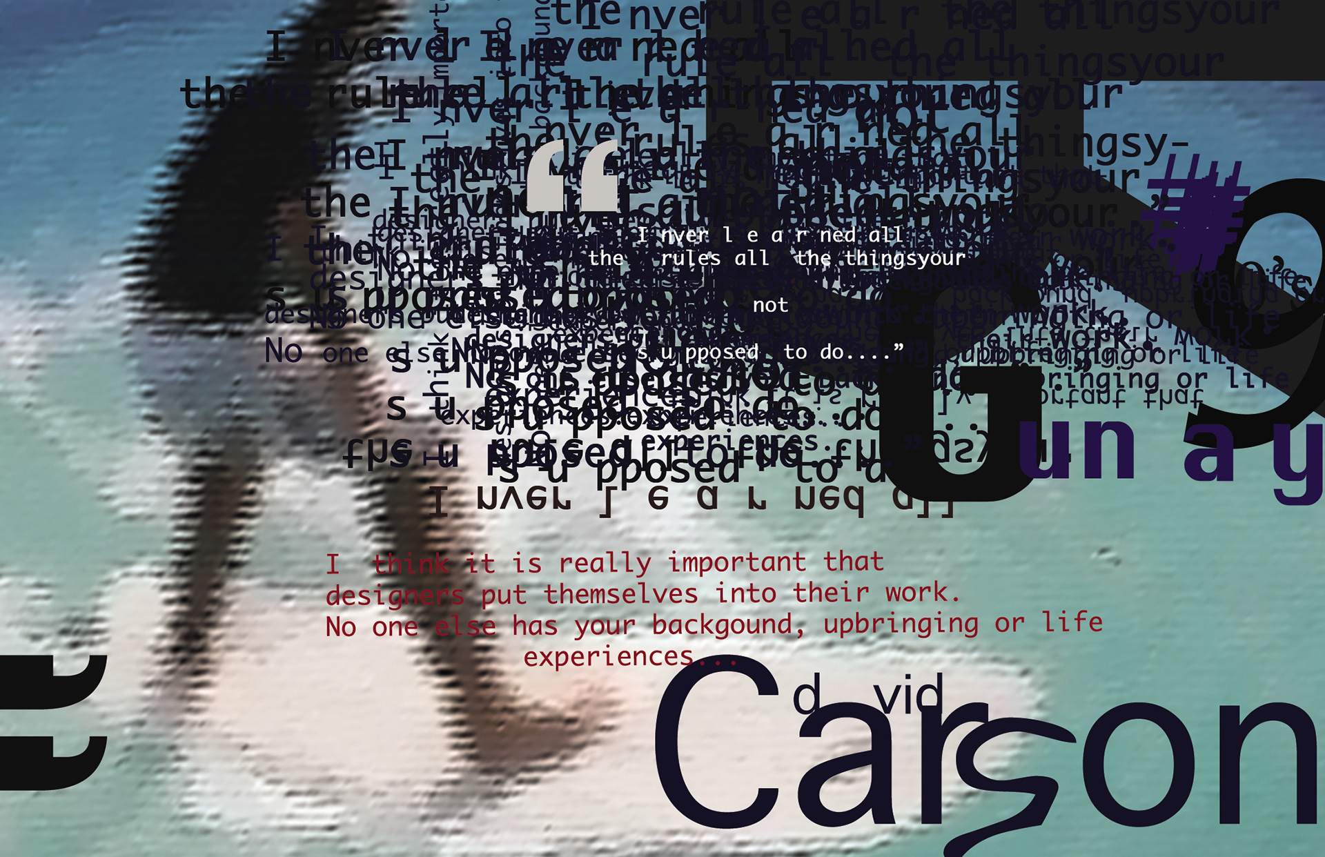
2. David Carson’s Experimental Typography
David Carson revolutionized graphic design in the 1990s with his unconventional use of typography in publications like Ray Gun. His approach often defies traditional readability, favoring expressive, deconstructed letterforms communicating emotion.
Carson’s work stands out because it challenges conventional rules of typography. It connects to our discussions on hierarchy and emphasis, showing how typography can evoke strong feelings beyond mere legibility. His fragmented layouts use contrast and asymmetry to create dynamic compositions that engage the viewer. Carson’s typography is an excellent example of how form can influence meaning in design.
Citations
- Carson, D. (1995). The End of Print: The Graphic Design of David Carson. Chronicle Books.
- McCoy, K. (1990). "Typography as Discourse." Eye Magazine.
3. Blackletter Revival in Modern Branding
Blackletter, historically associated with medieval manuscripts, has seen a resurgence in modern branding. Companies like Supreme and Balenciaga incorporate blackletter to evoke a sense of heritage and boldness in their designs.
I selected Blackletter Revival because it demonstrates how historical typefaces can be reinterpreted for contemporary use. It connects to our study of type classifications and the emotional impact of type choices. The sharp, angular letterforms of blackletter create a strong visual presence, often associated with luxury or counterculture. This resurgence underscores the cyclical nature of design trends and how past aesthetics can find new relevance.
Citations
- Bringhurst, R. (2004). The Elements of Typographic Style. Hartley & Marks.
- Typographic Revival Trends. (2023). Creative Review.
