Project Objective
To learn the anatomy of type and appropriate terminology, design an engaging poster that shows the successful use and understanding of design principles, designate and label the letter parts, to successfully convey a mood through typography, composition, and color, and balance multiple parameters at once, to apply a consistent, legible, and functional typographic labeling system throughout the design.
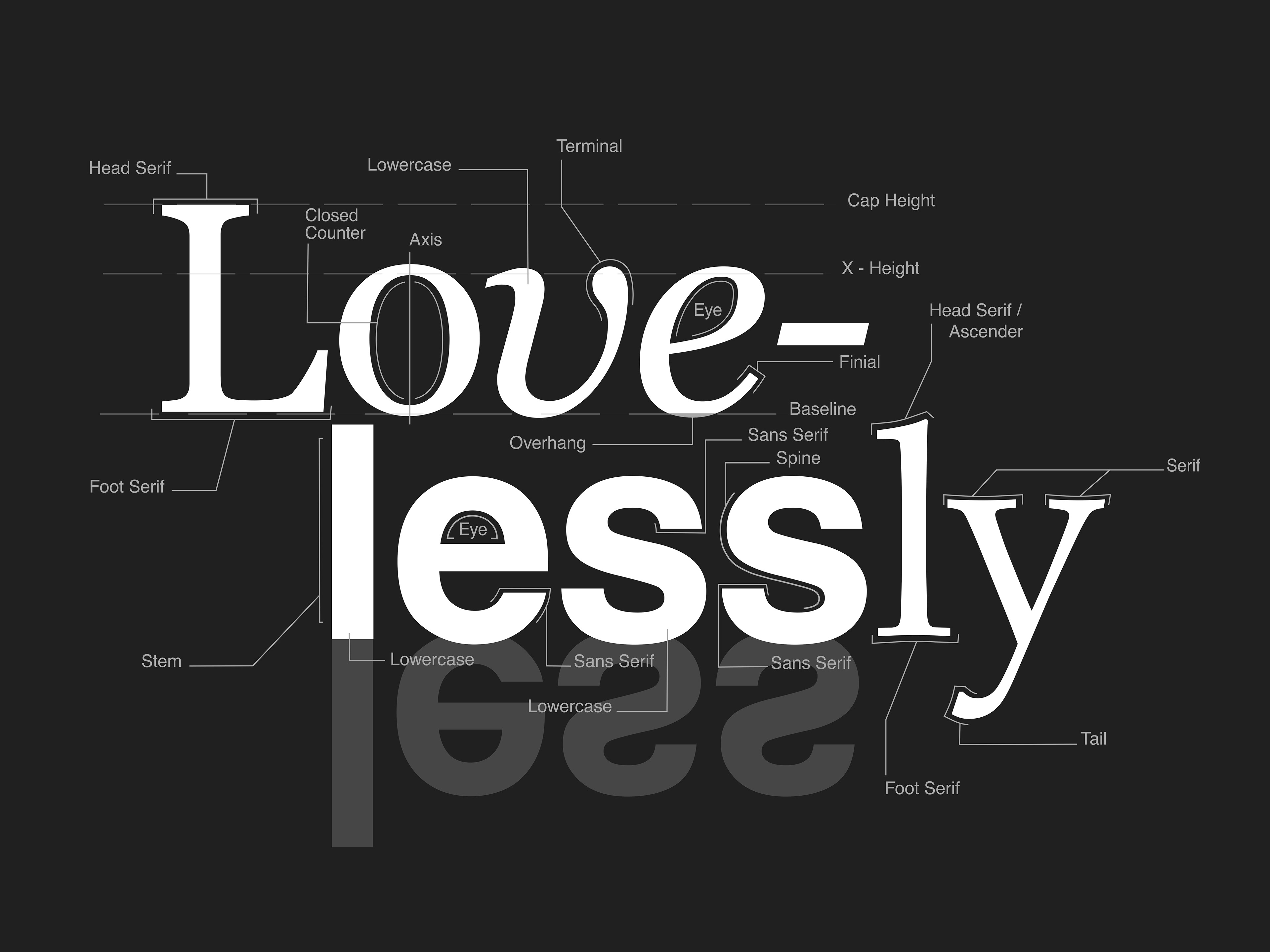
Project Requirements
- Create a 9 x 12-inch poster (either vertical or horizontal) by writing a chosen word (with a minimum of ten letters) that showcases many letter parts in traditional serif and/or sans serif typefaces (plus an optional script of blackletter form on which you may identify a swash or flag). Label a minimum of two parts per letter, or 20 parts overall. Some letters will have more identifiable parts than others, and your composition may benefit from a greater number of parts. Make sure that labels and lines are clearly defined and legible.
- The labels should be set in a highly legible typeface. Be consistent in the design and placement of the labels for maximum audience comprehension.
- Like a user manual, the parts list should be easy to understand and navigate. Consider the visual weight of the letters to create a balanced composition. Use hierarchy to guide the viewer through the layout—the labels should not overpower the letterforms. If printing, do a test print to be sure that your labels are clear and legible.
- Evaluate the rhythm of the positive and negative space of the letterforms and make adjustments as necessary.